
JournalPhotography10 min
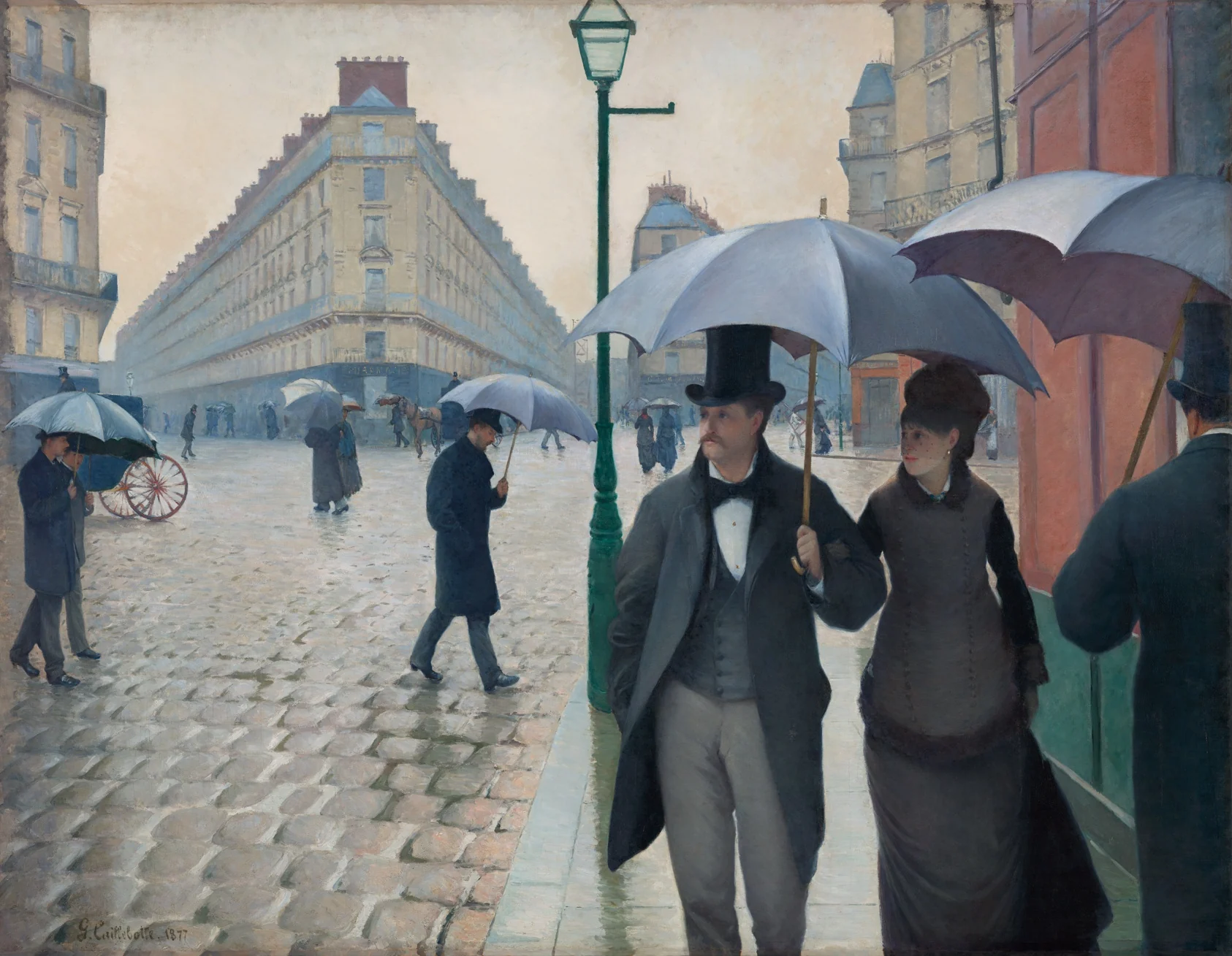
There is a piece of advice photographers repeat almost as a law: the eye goes first to the brightest area of the image. There is a lot of truth in it. A bright patch really is noticed quickly, especially when everything around it is darker. But taken literally, the principle lets you build a tidy frame in which the viewer somehow still looks in the wrong place.

Because attention is built more intricately than a light meter. Besides light, we are pulled by faces, eyes, sharp colour, a contrasting edge, a familiar shape and any breach of order. A small human face deep in the frame can outweigh a large bright window. A red dot sometimes shouts down an entire grey wall. And a subject’s gaze all but physically forces us to check what they have seen.

The blurred-vision test is useful too: squint slightly, or step back from the screen until the small details disappear. The large masses of light and colour remain, and with them the basic hierarchy appears. Then you can come closer and check whether faces and meaningful details break it.
So the question is not which patch is brightest. The question is which signals in the frame are arguing over the right to be first. If the subject’s face sits in a light zone, the background does not pull attention away, and the pose and the direction of the gaze lead onwards, the route comes out clear. If every signal points a different way, the viewer starts darting about.
Another trap is confusing attention with area. A large object does not automatically become the main one if it is even and familiar while a small detail carries human meaning. On a phone screen the ratio shifts again: a subtle gesture can get lost, while a face or a patch of colour grows stronger. So it is worth checking the final route not only on a large monitor but at the real size of publication. We are not making an image for abstract ideal vision but for a specific viewing situation.
This can be used emotionally. Say a person is standing by a window in a room. Make their face the most noticeable thing and we meet them at once, then examine the space. Leave the face in half-shadow and put the light behind them, and we first feel the room, the distance and, perhaps, the loneliness. The subject is the same; the introduction is not.
The eye is not a spotlight but a restless editor
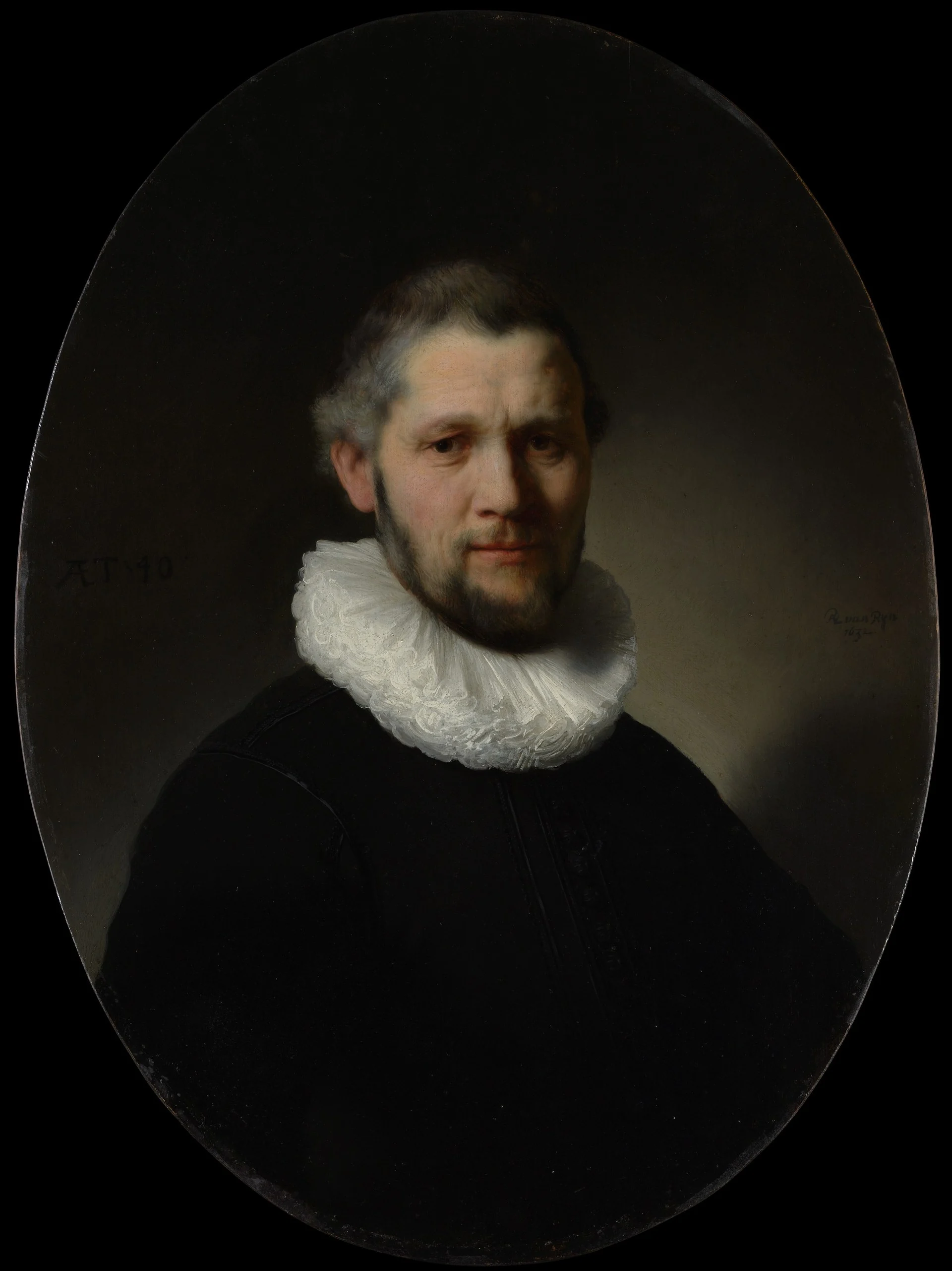
It is tempting to imagine attention as a spotlight: it switches on, lights the main object, and the rest is easy. In practice the eye behaves more like a restless editor. It gathers features fast, checks them against experience, looks for a face, a danger, a piece of text, a familiar shape, and only then decides whether to linger. Brightness is an important signal, but far from the only one. A white wall can be the lightest part of the frame and stay background if two eyes are visible in the darkness beside it.
The special position of the face is explained not by any mystique of composition but by our social nature. From childhood we learn to distinguish expressions, the direction of a gaze, age, intention. A few pixels resembling eyes and a mouth instantly assemble into a person. Hence an unpleasant surprise for the photographer: a random passer-by in the background is capable of stealing the scene from a perfectly lit subject. They are small, but they carry too strong a signal of meaning.
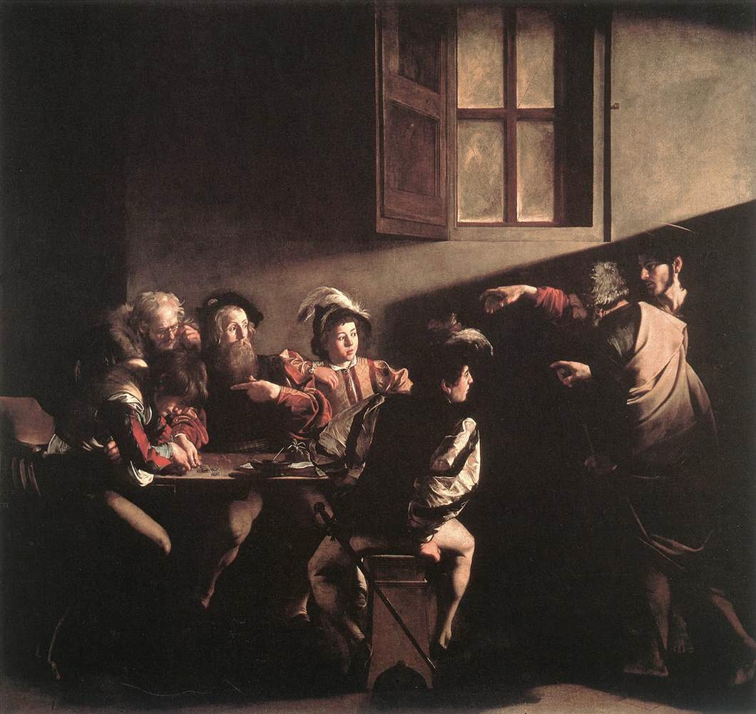
Text works in a similar way. A sign, a number, a large slogan on clothing starts the act of reading, and reading is hard to stop on command. If the words are not needed by the story, the viewer will spend attention on them anyway. Sometimes it is enough to shift the camera position slightly, take the sharpness off, or wait for the person to move. Painting everything out in post is usually the last and dullest option. It is far more interesting to decide, while still shooting, whether the viewer should read that phrase and what happens after they do.
Colour is decided by its surroundings, not by saturation
A colour accent depends not on absolute saturation but on its surroundings. An orange cup in a warm interior can all but vanish, while a pale green detail among reddish surfaces starts to ring. So the saturation slider on its own explains very little. What matters is the relation between colours, their area and their place in the route. A small cool point in a warm scene often works like a slit into another space: first it attracts, then it changes the feeling of the whole frame.
This is where emotional steering begins. If we see a face first, the photograph offers an introduction. If the space comes first and the person is discovered later, distance appears, or loneliness, or a sense of surveillance. If attention drops instantly on a hand clenched in a pocket, we read a state before a personality. The same subject can seem open, lost or dangerous purely because of the order in which the viewer receives the information.
The hidden edit of a still frame
Editing in cinema1 steers that order through time: first the wide shot, then the face, then the detail. In photography there seems to be no time, but the route of the eye creates it. A bright doorway leads into the room, the diagonal of the floor brings us to the figure, their gaze sends us to an object on the table. The viewer assembles the sequence themselves, although every element is present at once. Composition, then, is not the arrangement of objects in pretty places but the hidden edit of a single motionless frame.

Contrast, too, comes in kinds. Tonal — light beside dark. Chromatic — opposing or differing hues. Focal — the detailed beside the blurred. And semantic — a white dress in a dirty room, a child among adults, a motionless person in a flowing crowd. The last is often stronger than the first three. You can mute a background perfectly, and a strange detail will still win, because the viewer wants to know what it means.
In post-processing it helps to think not about “making it pretty” but about sorting signals into roles. Lightening a face locally is one decision. Darkening a bright edge of the frame slightly is another. Reducing the saturation of some accidental packaging, keeping the cold in the shadows, making sharpening less aggressive — none of that is cosmetics; it is editing attention. The point is not to cross the line beyond which the viewer feels somebody else’s hand. Good correction does not mark the route with arrows; it makes the necessary movement feel natural.
The size of publication rearranges the hierarchy
The size of publication changes the hierarchy more than people tend to think. On a large print you can build the slow discovery of a small figure. In a phone feed it turns to dust. Meanwhile a large patch of colour that looked crude on the monitor may be the only way to keep the intention alive. So there is no “correct” version without a context. A frame for a wall and a frame for a screen can require different density, contrast and even cropping.
When the route is broken on purpose
Sometimes it is useful to break a clear route deliberately. Make an empty space the bright one, for instance, and leave the subject at the periphery. The viewer will feel the lack and start looking for a reason. That is how anxiety or anticipation is born. But a breach only works in relation to an order. If a frame holds ten equally strong accidents, that is not a riddle but noise. For a viewer to get lost productively, the photographer has to know exactly where they will lose the way and what they will find instead.
Finally, attention is not sympathy. We can look at the unpleasant, the dangerous, the strange — sometimes longer than at the beautiful. So the author’s task is not always to lead gently towards the subject. Sometimes the eye needs to stumble, come back, feel awkward. The question is not “where is everyone obliged to look” but “what experience will come out of this movement”. Once the answer is clear, bright patches, colour, faces and lines stop being rules of composition and become a language.

“Laws of the eye” are a probability, not a recipe
It is worth not overrating talk of “laws of the eye”. Eye-tracking maps2 look convincing but yield no eternal recipe: the result changes with the task, the length of viewing, the size of the image and whether the person knows the context. One viewer looks for a face at once, another reads the sign first, a third recognises a familiar place. The photographer does not program an identical trajectory for everyone. They raise the probability of the intended reading and remove the interference that is guaranteed to break it.

So I would test not one point of entry but two modes. In the first the frame is shown for a second — that reveals the hit, whatever works before thought. In the second it gets half a minute — that reveals whether there is anywhere to move after the first impression. A photograph built only for an instant accent may win the stop in a feed and lose the second encounter. And too quiet a frame will not even get its chance at a slow reading. Real work with attention begins between those extremes: catching the eye not with a trick but with a promise the image then keeps.
A photographer is not obliged to hold the gaze by force. Rather, they lay out invitations. Light offers a way in, a face holds, a gesture or a line shows the road. When all of it works together, the viewer does not notice the construction. They simply look where it felt natural to look.
Notes
- 1The order of shots changes the meaning of each one — Lev Kuleshov showed this back in the 1920s: the same face after a bowl of soup, a coffin and a woman was read by audiences as hunger, grief and desire. ↑
- 2Eye tracking is the recording of eye movements. Alfred Yarbus’s classic diagrams of the 1960s showed the essential thing: the trajectory changes with the question the viewer was asked beforehand. “How old are these people?” and “Is the family wealthy?” produce different routes across the same picture. ↑