
JournalPhotography12 min

There is a simple way to see the Purkinje effect1 without a laboratory or a set of tables. Put a red object and a blue one side by side, look at them in ordinary daylight, then come back when the room or the street starts to darken. In daylight the red one may look brighter and more active, the first to demand attention. At dusk it loses its force fairly quickly, while the blue or blue-green one stays relatively light. The objects have not changed, and the light has not repainted them one by one. What changed is the mode in which the eye assembles the visible world.

The shift is easiest to notice not deep at night, when colour has all but gone, but precisely in the transitional state between day and darkness. It is called mesopic vision2: the cones responsible for daytime colour and fine detail are still working, but the rods, far more sensitive to weak light, are joining in ever more noticeably. In bright conditions the peak of human luminous sensitivity sits at roughly 555 nanometres, in the yellow-green region; in darkness the scotopic peak moves to about 507 nanometres3, towards the blue-green part of the spectrum. That is why long-wavelength reds fall away visually much faster, and cool tones appear relatively brighter. This shift is what we call the Purkinje effect.

It matters here not to turn a convenient explanation into a fairy tale about rods that “see blue”. In complete darkness they give us no proper colour image at all. What is really going on is a change in the relative brightness of different parts of the spectrum — and, at dusk, a complicated joint performance by rods and cones. The world does not get a built-in blue filter. It loses saturation, reds and yellows darken faster, detail becomes harder to tell apart, and the familiar daytime balance of colours falls apart. For an artist that caveat is the important part: without it, physiology turns into one more recipe that says “paint the night cyan”.
Photography begins where physiology ends
For photography the interesting part starts exactly where physiology stops. The camera does not go through our dark adaptation4 and does not live through a change of visual modes. The sensor records light according to its own spectral response, the exposure, the white balance and whatever happens in post. Put the camera on a tripod, give it a long exposure and lift the shadows carefully, and it can show colour in places where the person standing there saw an almost colourless mass. Technically the camera invented nothing: those photons really did arrive on the sensor. But the experience of the scene was a different one.
That is where the first fork appears. We can treat what the camera recorded as photographic truth, and then a night landscape turns out unexpectedly detailed and colourful. Or we can try to give back the way the place felt to a human being: mute the warm tones, drop overall saturation, cool the shadows and part of the midtones, make the distance less available. Neither option is automatically the more honest one. The camera tells the truth about the light it registered, the eye tells the truth about perception, and the photographer chooses which of those truths to put first.
How to give the viewer the feeling of dusk
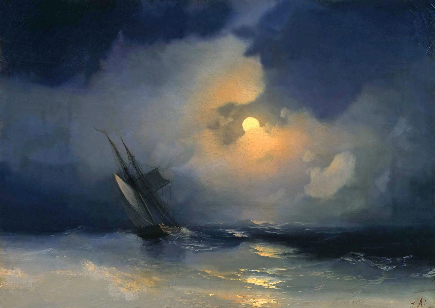
When presence is what matters to me, I usually think not about the “correct” shade for twilight but about what was happening to attention. In reality the warm ground stopped being a colourful carpet, red clothing no longer shouted from the depth of the frame, while a cold gap of sky, water or pale foliage held the eye. So it is not enough in post to drag the temperature slider to the left. The hierarchy has to be rebuilt: what became more noticeable in this scene, what stepped back, where vision still told colours apart, and where it was already working with brightness and silhouette.
Say you have a road shot after sunset. In the raw file the camera kept the brown earth, the greenery at the edges and the orange remains of light on the horizon. Cool the whole image evenly and the ground turns bluish, a person’s skin turns unhealthy, and the dusk ends up looking like a ready-made preset. It is far more convincing to weaken the saturation of reds and yellows in the shadows, cool the midtones slightly, keep a thin warm band where the sky really is still giving off its last light, and let the deepest areas lose colour almost entirely. Then the frame does not announce “blue was applied here” — it moves the viewer, step by step, into the same mode of seeing.
The emotion is born out of that transition. A cold shadow does not in itself mean anxiety, loneliness or mystery: colour dictionaries are far too fond of passing off such correspondences as universal. But cold that quietly displaces the last of the warmth reads as a change of state. The day is leaving, the space becomes less available, familiar things lose their everyday clarity. Push that process a little harder than it felt on location and the night can become deeper and more estranged. The viewer will feel not simply a late hour, but the moment when the world stopped being entirely ours.

The reverse move: giving the night a colour the eye cannot see
The Purkinje effect can also be used the other way round. Picture night mountains under a starry sky. In reality, at that light level, the eye will barely let you see the rich reds, ochres and yellows of the rock. The mountains will be dark, coolish or nearly neutral, their daytime colour giving way to a structure of brightness. But a camera on a long exposure keeps the information, and post lets us give the rock its warmth back. We keep the night sky, the stars and the general sense of darkness, yet we give the stone a colour that human vision, in this situation, usually does not show.

A small mismatch appears. The scene is recognisable, physically possible, the details are not necessarily fantastical — and still it does not agree with our inner experience of night. The brain accepts the starry sky, accepts the mountains, and stumbles over a warm red massif that should have disappeared. That is exactly why the eye lingers. This is no longer an ordinary colour accent, where the most saturated object simply wins the competition. We are breaking a rule of perception the viewer has most likely never put into words but has lived through many times.
This is how you get a light surrealism without floating rocks and an enormous moon. The night appears to reveal the true colour of a thing it normally hides. A philosophical note comes with it: the camera sees the rock not as it is available to a human being right now, but as we know it by day, or as some other visual apparatus might have seen it. The photograph joins two incompatible times in one frame — night lighting and daytime colour memory. That intervention can be far stronger than an obvious special effect precisely because it looks almost natural.
The device works well against banner blindness. Scrolling a feed, a person recognises familiar categories fast — sunset, stars, mountains, city neon — and moves on before they have looked at the particular photograph at all. A small breach of expected colour behaviour creates a delay. But a delay must not be confused with a shout. Crank the orange up to advertising plastic and make the sky poison blue at the same time, and the eye will stop too — just not necessarily for the reason the author wanted. The interesting moment is the one where the viewer believes the image first and only then realises that reality inside it has been shifted a little.

A decision like that needs an internal measure. A warm mountain stays a night mountain as long as its brightness, contrast and detail obey the night scene. You can bring the hue back without turning every stone into an object lit by studio light. You can strengthen the red in the midtones while keeping the deep shadows nearly colourless. You can let the warmth show on the surfaces that genuinely catch a faint scattered light instead of flooding the whole massif with it. Then the colour reads as a hidden property of matter. Once the warmth starts to glow by itself with no logic behind it, the photograph moves into open fantasy — which is also allowed, but it is a different contract with the viewer.
With a face the task becomes finer still. In a twilight portrait you can cool the surroundings, mute the warm tones of clothing and let the skin lose a little of its daytime saturation. But subordinate the face entirely to the general blue logic and the person can turn into a decorative detail of the landscape. Sometimes it is enough to keep a barely noticeable warmth in the skin relative to the background, even if the absolute colour stays cold. The viewer will not necessarily see “a warm face”, but they will feel that the living thing is separated from its surroundings. In another story the opposite is true, and almost colourless skin will deepen the estrangement. The decision depends not on a correct white balance but on the role the person plays in the scene.
Where to start in post
In practice I would begin work on a twilight frame not with colour but with the structure of brightness. As long as shadows that are too light and planes that are equally open keep telling the viewer “daytime”, a blue tint will be nothing but a disguise. First it is worth deciding which areas are genuinely available to the eye, where a silhouette is needed, where texture survives and what the source of light is. After that colour becomes a precise instrument: cold supports depth, weakened warmth retreats, a local warm area holds the person or the object. Do it the other way round and it is easy to end up with a great deal of beautiful colour and no night at all.
Why this is worth knowing even without night shoots
In that sense the Purkinje effect is useful even to a photographer who will never deliberately imitate twilight vision. It is a reminder that brightness and colour do not exist for the viewer separately from the conditions of viewing. The same red object occupies a different place in the composition by day and by evening, although its coordinates have not moved. Which means composition is not only the arrangement of shapes. It is also the temporary state of the eye, adaptation, the size of the image, the screen around it and the memory of how the world is supposed to look.

The camera here is neither an enemy of human perception nor a more objective judge. It simply sees differently. Its ability to accumulate light gives us material that may not have existed in direct experience: the colour of a starry sky, the hue of a distant rock, the structure of a shadow. Giving that up for the sake of a literal imitation of vision would be strange. But it is just as strange to assume that information pulled out of the sensor automatically is the only honest view of the scene. Photographic work begins the moment we understand the difference and use it deliberately.
So the Purkinje effect is not a small optical fact to be memorised for an exam. It is a model of authorial choice. You can bring the image closer to the human sensation of dusk: mute the warmth, strengthen the relative role of the cold, leave parts of the space unavailable and give the viewer back the feeling of their own presence. Or you can do the opposite: show, at night, the true colour of stone, wood or wall, break through the habitual expectation and create the sense of a world that has opened wider than the eye allows.
In the first case we help the viewer recognise something they have lived through. In the second we make them notice that reality could have looked otherwise. Both decisions work not because cold colour is always emotional and warm colour always draws attention. They work because they rest on a deeply learned experience of seeing, and either confirm it or break it with care.
The camera records light. The eye continuously rebuilds it into a world one can live in. And the photographer decides where to keep that human limitation, where to strengthen it, and where to let the viewer, for a few seconds, see more than they are used to seeing in the dark.
Notes
- 1Described by the Czech physiologist Jan Purkyně in 1819. He noticed that at dawn the red flowers that had been the most striking in the garden the day before looked almost black, while the blue ones looked light. ↑
- 2Mesopic vision is the intermediate mode between daytime (cone) and night-time (rod) vision. It works roughly from thousandths of a candela to a few candelas per square metre: exactly dusk, a yard under street lamps, a dimly lit room. ↑
- 3These are the curves of relative luminous efficiency adopted by the International Commission on Illumination: the daytime one peaking near 555 nm and the twilight one near 507 nm. ↑
- 4Full adaptation to darkness takes a human being about half an hour, and most of it belongs to the rods. That is exactly why a room you have just walked into from a lit street looks completely different twenty minutes later. ↑